Montreal Art Gallery
Case Study
Project Duration: May - September 2023
Role: UX designer, UX researcher, UI designer from conception to delivery
Responsibilities: Conducting interviews, paper and digital wireframing, low and high-fidelity prototyping, conducting usability studies, accounting for accessibility, and iterating on designs.
The Goal
Design an app where visitors can access the museum’s audio tours and see museum information and exhibition updates.
User Research
I conducted interviews and created empathy maps to understand the users I am designing for and their needs. A primary user group identified through research was tourists. The secondary user group was art students and art professionals.
The primary user group confirmed initial assumptions about the museum’s visitors but research also revealed that local users would like to have access to more services through the app.
Pain Points
Time
Scheduling a guide is time constricting and costs extra
Personas
Problem Statement
Joon is a tourist who needs easy access to a tour guide so that he can enjoy the museum and learn without feeling out of place.
User Journey Map
Mapping Joon’s user journey revealed how helpful it would be for users to have access to a dedicated museum app.
Paper Wireframes
Taking the time to draft iterations of each screen of the app on paper ensured that the elements that made it to digital wireframes would be well-suited to address user pain points.
Digital Wireframes
As the initial design phase continued, I made sure to base screen designs on feedback and findings from the user research. Easy navigation was a key user need to address in the designs.
Low Fidelity Prototype
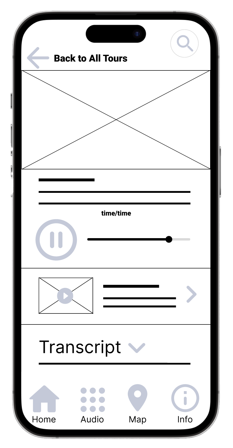
Using the completed set of digital wireframes, I created a low-fidelity prototype. The primary user flow I connected was choosing and playing an audio tour, so the prototype could be used in a usability study.
High-Fidelity Prototype
The final high-fidelity prototype presented cleaner user flows for choosing and playing an audio tour. It also met user needs for a sections showcasing temporary exhibitions.
Accessibility considerations
What I learned
While designing the Montreal Art Gallery app, I learned that the first ideas for the app are only the beginning of the process. Usability studies and feedback influenced each iteration of the app’s designs.
The Product
Montreal Art Gallery is an art museum located in the city centre of Montreal serving the local community and visiting public including a permanent collection and curated exhibitions.
Crowds
Attending a museum in a group with a guide can feel crowded
Accessibility
Reading small labels next to artworks is unpleasant and not accessible to all
Usability Study
I conducted two rounds of usability studies. Findings from the first study helped guide the designs from wireframes to mockups. The second study used a high-fidelity prototype and revealed what aspects of the mockups needed refining.
Round One Findings
Users want an intuitive navigation
Users want to be able to jump to next stop within a tour
Users want to be able to see news about the museum
Iterations after Usability Study #1
Early designs allowed for a tour to be played but users did not see the different stops. The revised design allows for users to swipe and skip to upcoming artworks.
Iterations after Usability Study #2
The second usability study revealed a frustration with the size of the icons for the tours and the incomplete description. In the new version the images take up the whole width of the screen and the number of stops and length of the tour are included.
Provided access to users who are hearing impaired by adding transcripts under each audio tour.
Responsive Website
Impact
The app makes users feel like the Montreal Art Gallery really thinks about how to meet their needs.
Round Two Findings
The search feature is not helpful
Users want to be able to leave the audio playing in the background
The All Tours Section needs short, clear details
Used icons and text labels to help make navigation more accessible. A selected tab is indicated by a change in colour and the use of an underline to avoid confusion for people who are colour blind.
Next Steps
Conduct another round of usability studies to validate whether the pain points users experienced have been effectively addressed.
Conduct more user research to determine any new areas of need.
Colours comply with WAI.
The Problem
Visitors need to navigate the museum and learn about the artworks without the need for a physical guide.


